UNC Greensboro creates remarkable real-world impact, every day. University Communications proudly showcases the people, places, research, and innovation that is uniquely UNCG. Providing specialized communications and marketing expertise, our work promotes and supports UNCG’s brand, reputation, enrollment, fundraising, and community engagement.
University Communications supports campus partners and assists media outlets to help share the UNCG story of opportunity, excellence, and impact of all Spartans. Through consistent execution of internal and external communications across the University, together, we build connections benefitting our campus and community.
Brand Guide
How we tell our story is more than a logo, a slogan, a mascot, or an advertising campaign. Our brand embodies who we are and the everyday experiences of being and collaborating with a Spartan. Visit our brand guide to learn how we make clear connections to our fundamental values and core messaging.
A comprehensive writing style is invaluable to maintaining consistency and clarity across communications. Our editorial guide provides the University’s messaging, tone, naming, storytelling, and style guidelines.
The Pro-Communicators Group comprises more than 150 communicators who collaborate regularly on communications and marketing.
Graphics and more!
From social media graphics and physical signage to the latest video and special occasion assets, University Communications’ provides a wealth of promotional elements for campus partners to use. See what’s new and get started!
Each year UC’s video team records everything from student profiles to commencement ceremonies from all angles, including aerial drone shots of campus.
800
News and pR stories written Annually
The writers at University Communications craft content that supports our brand pillars, shows the unique and diverse student body, and informs the community.
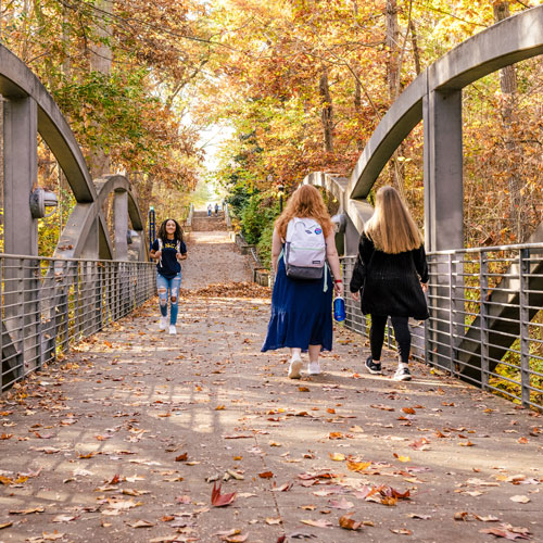
60,000
Photos taken per year
Photographers in UC build a unique image library each year filled with people, places, unique research and the beauty of our one-of-a-kind campus.
Are you looking for creative content, video, or images to help tell your UNCG department’s story? View our resources page and find great content available to all of our campus partners.
Connect with Us
Stay in touch with what’s happening on our vibrant campus and beyond via social media!